Here I come with post where I create graph that displays results from my testing lab I described in previous post. Reporting Services offers lots of possibilities of data visualisations. Graphs are basic components for scenarios you need to visualise your data.
File -> New -> Project

Continue with Business Intelligence -> Reporting Services -> Report Server Project. At the bottom part of New Project window set Project Name and its location.
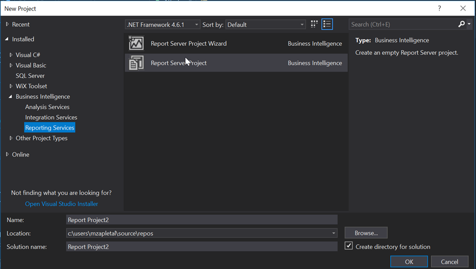
New empty Report Server project was created.
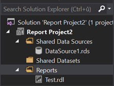
Add New Report, right click Reports in Solution Explorer.
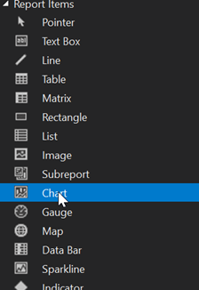
Go to Toolbox pane and click on Chart component.
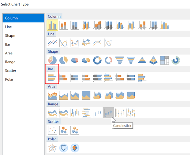
Select Bar Chart type from chart palette.
New Chart component is added into the Visual Studio design area.
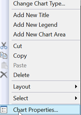
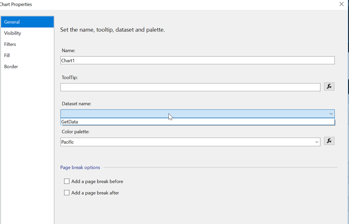
Right click on Chart to get Chart Properties dialog box. Map Chart to its dataset. Select GetData dataset from Dataset name select box.
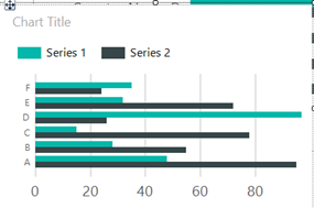
Our goal is to get something similar on picture bellow. We want to get results from our tests. It will be grouped by categories represented by tested counters. Set each scenario to chart series.
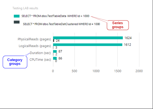
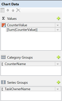
When you click on chart component you get Chart Data dialog box on the right side.
- In Values section select CounterValue, results from our tests.
- Set CounterName to Category Groups to get testing perspective of our data, counters.
- TaskOwnerName will be set as Series Groups, scenarios we tested
Finally, we got simple chart as on picture bellow.
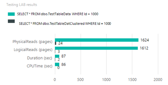
Reporting Services Chart is very complex component. I didn’t show all its possibilities it has. In this post I created the simplest one Chart to represented lab data.

